It’s a DIY kitchen renovation project that Charles and I naively thought we could knock out on a three-day weekend in July but actually ended up taking four months to complete; thanks to my water breaking early August and pausing everything in our lives for 38 days.
But it’s done! We finished the last mini-project for our kitchen (getting two shelves put up) last weekend and we are officially *done* with working on major home improvements for a lonnnnng while now that Beau is home.
Our DIY kitchen renovation was a true labor of sweat, persistence and love. As I mentioned in this post, Charles did ALL of the handiwork while I served as project researcher/manager and supply orderer. With it being our first time ever taking on a home project this big, we’re really proud of ourselves for transforming our 1970’s kitchen into the sleek, modern space we envisioned.
Check out the before and after photos below!
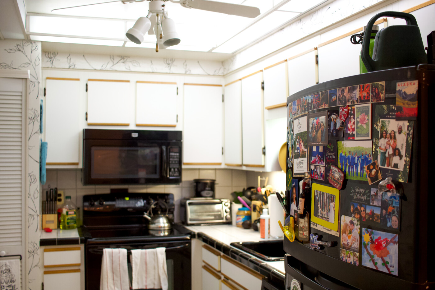
^^ BEFORE… Behold. A super dated looking kitchen with tile countertops, laminate cabinets and wallpaper that was lacking in countertop/prep/storage space. The only thing in the room we liked were the black appliances. When we first moved in three years ago, Charles and I had initally planned a full gut of the space and bring in a contractor to replace cabinets and countertop but the quotes we received were in the $10,000 range which was way out of our budget at the time.
So we decided to wait it out and save up money to do a full renovation in five years (2023). But then I found out I was pregnant this year and Charles was like “If we don’t update the kitchen now, it won’t happen for another three to fours years until baby is bigger.”
In response, I went down the deep end of Google and Youtube to see if we could do some low-key, diy cosmetic updates to the kitchen that would hold us over until we had enough saved up to fully renovate.
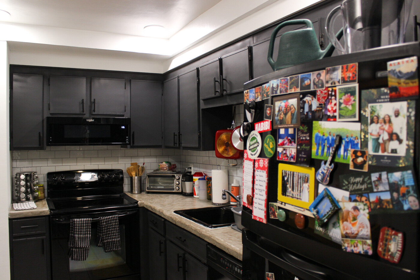
^^ AFTER… What resulted was us spending less than $1,500 to completing transform the space by doing it ourselves.
I had wanted to paint our existing cabinets a dark olive green color but Charles was adamant we keep the kitchen monochrome to coordinate with our appliances. After a bit of debate, we ended up going with his color scheme and I’m so glad we did.
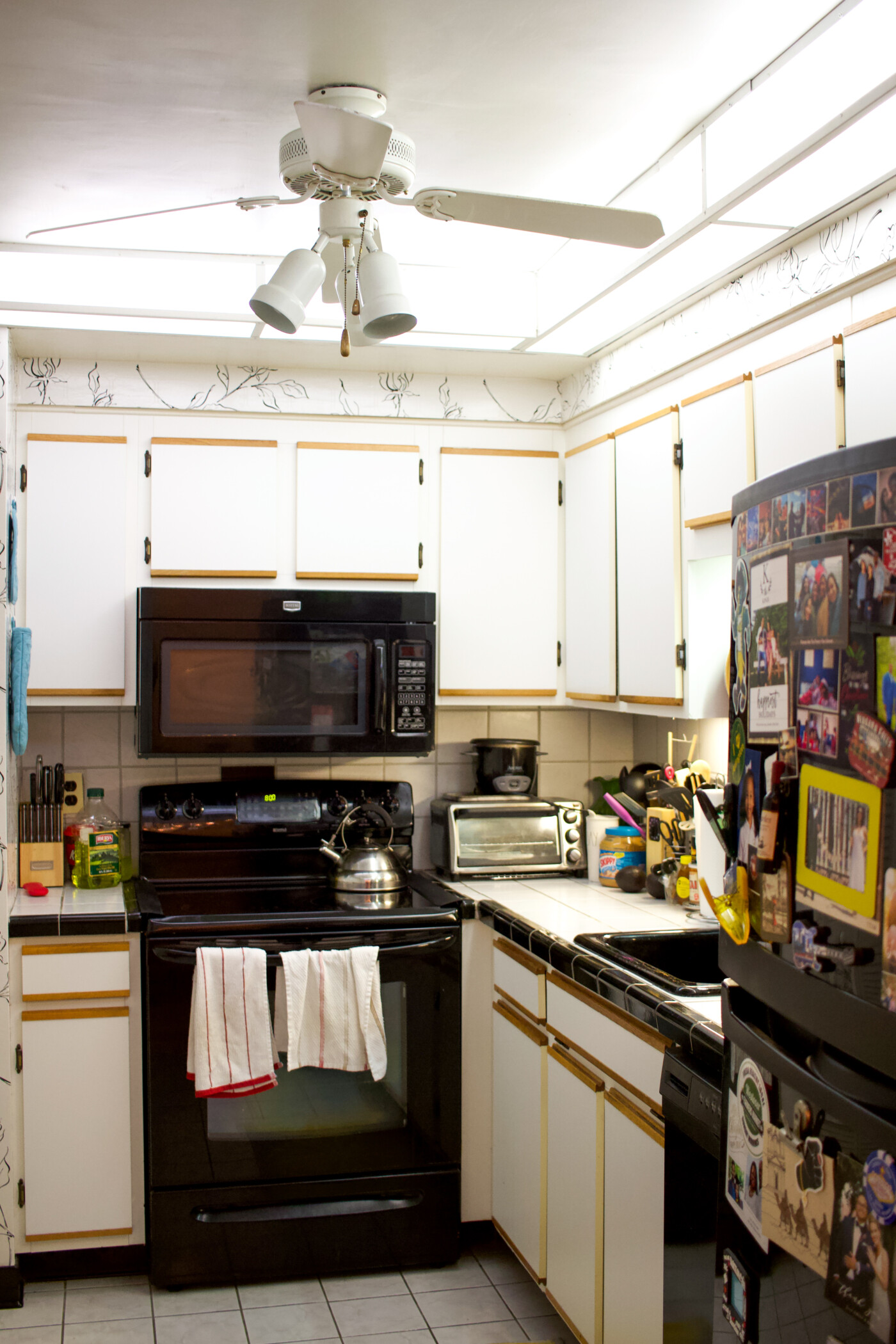
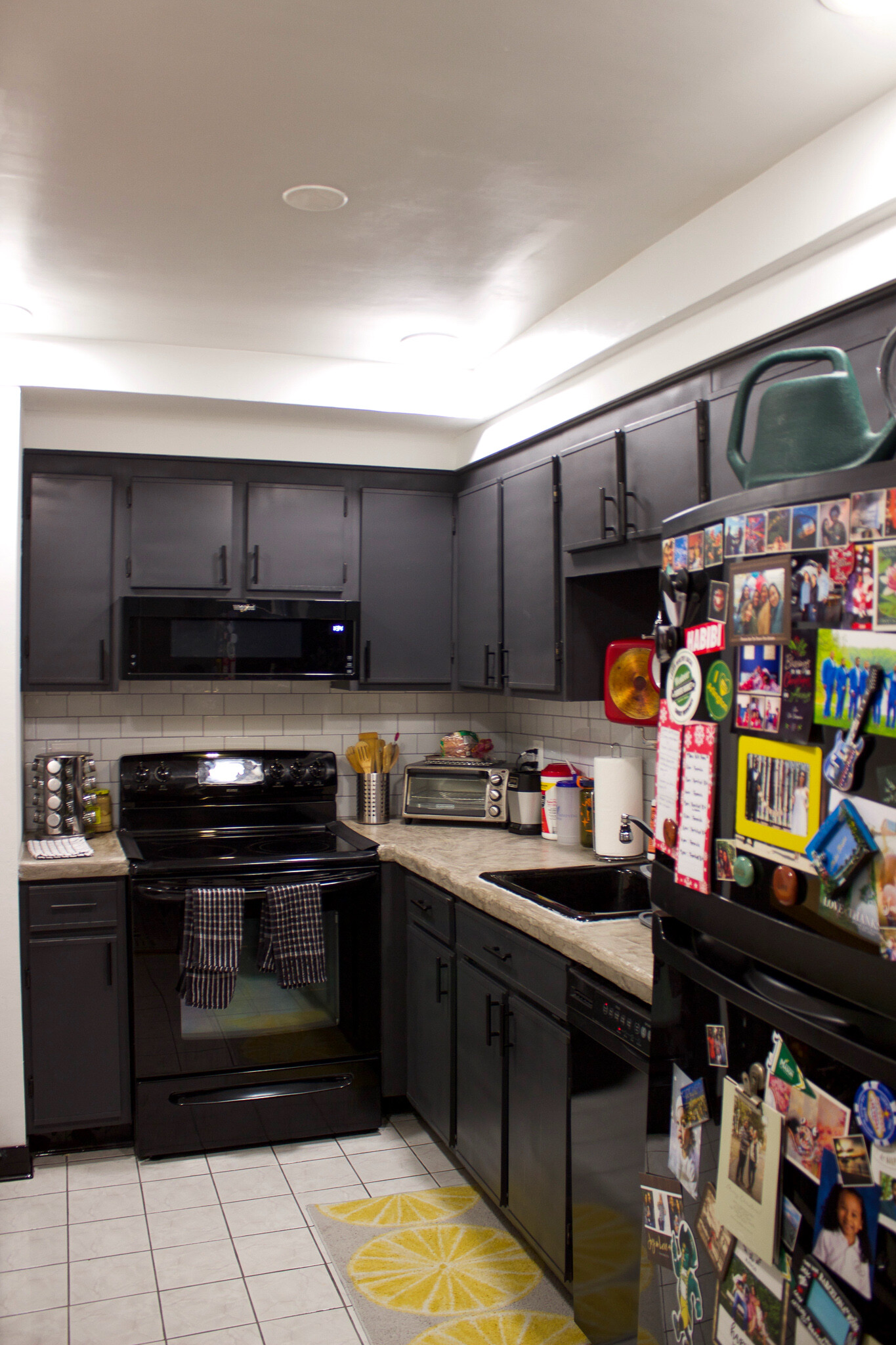
We went with a dark slate grey color on the cabinets (one gallon of Benjamin Moore’s Black Panther) and added these black handles to complete the look.
Our second biggest splurge was replacing the existing hood microwave for a half-size low profile microwave. The original was big and bulky and blocked sight lines to the stove when cooking. I used to have bend my head down to the side to see my pots and pans while cooking… Now the air space above the stove is much bigger for the better.
We also removed the original ceiling fan and lights and installed recess lighting which made the ceiling look much higher.
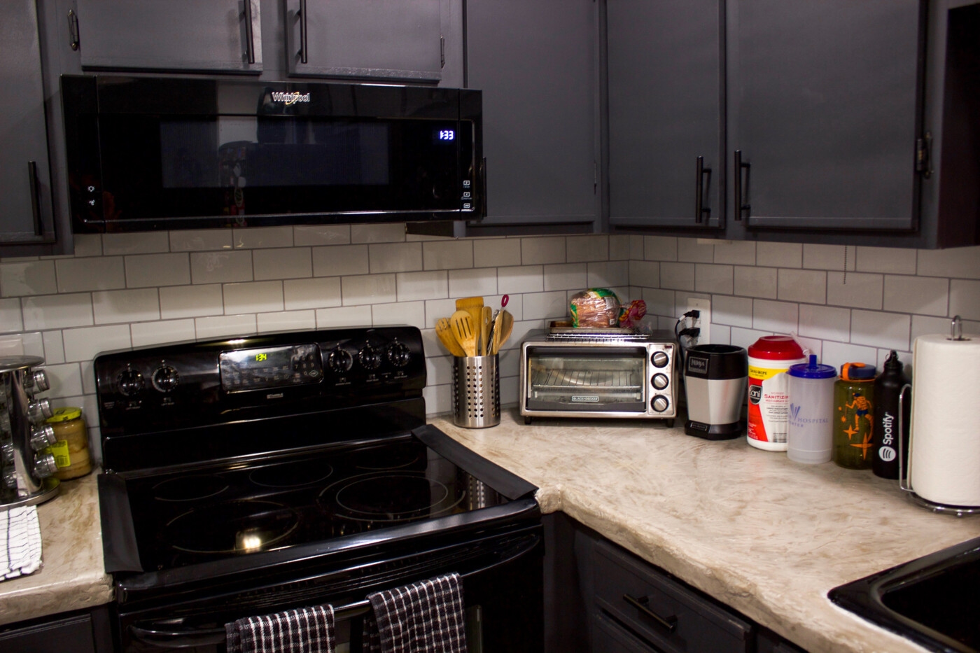
While researching different options for replacing the tile countertop, I learned that it isn’t recommended to put a new countertop over old cabinets so that option was quickly ruled out. We then considered resurfacing the countertop – basically painting over them so it’s one color. But that would mean we’d still have a tile countertop which defeated the point.
Sooooo I kept googling around until I found this DIY concrete countertop overlay post by A Beautiful Mess. The only thing we didn’t do according to the blog post was sand the concrete down so it was all one, flat, level smooth surface… Charles just sanded it down to point that it was smooth but we kept the imperfect ridges – going for a ‘stone effect’ look.
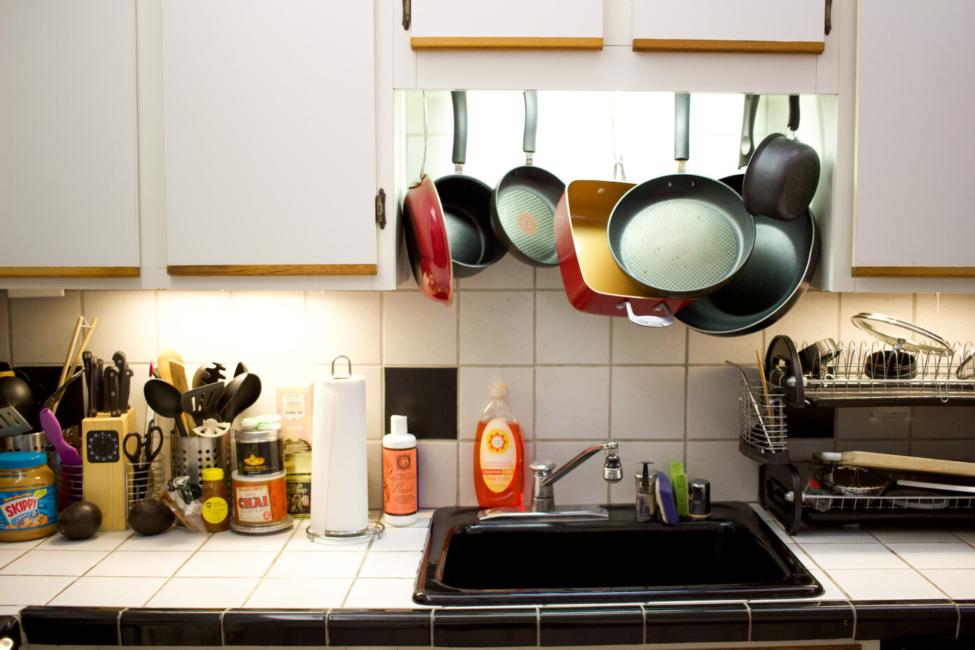
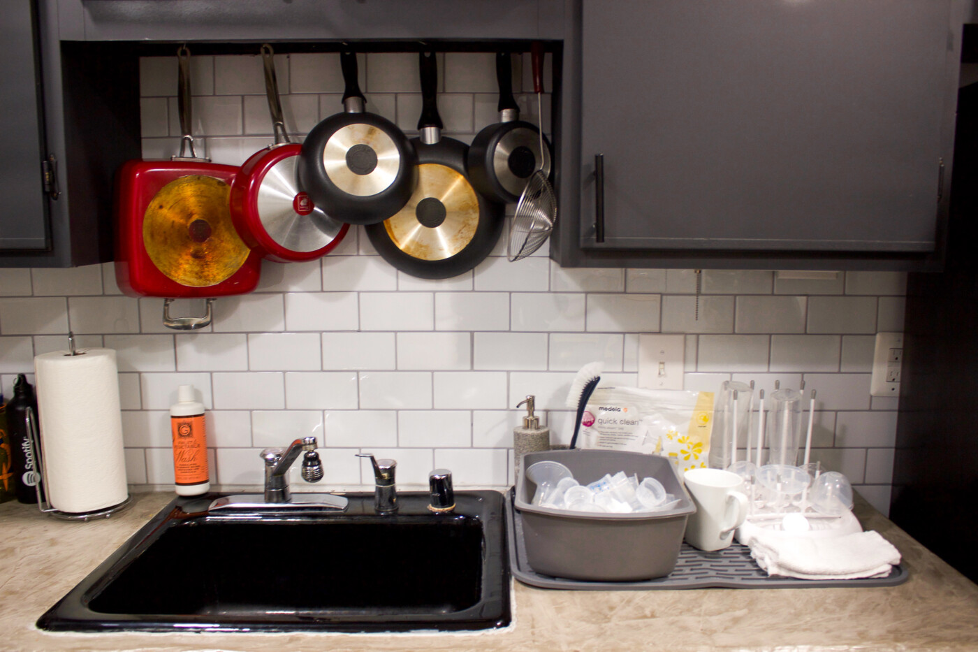
For the walls, we used these subway tile stickers and stuck them on the existing square tiles – a super quick project that we knocked out in one day.
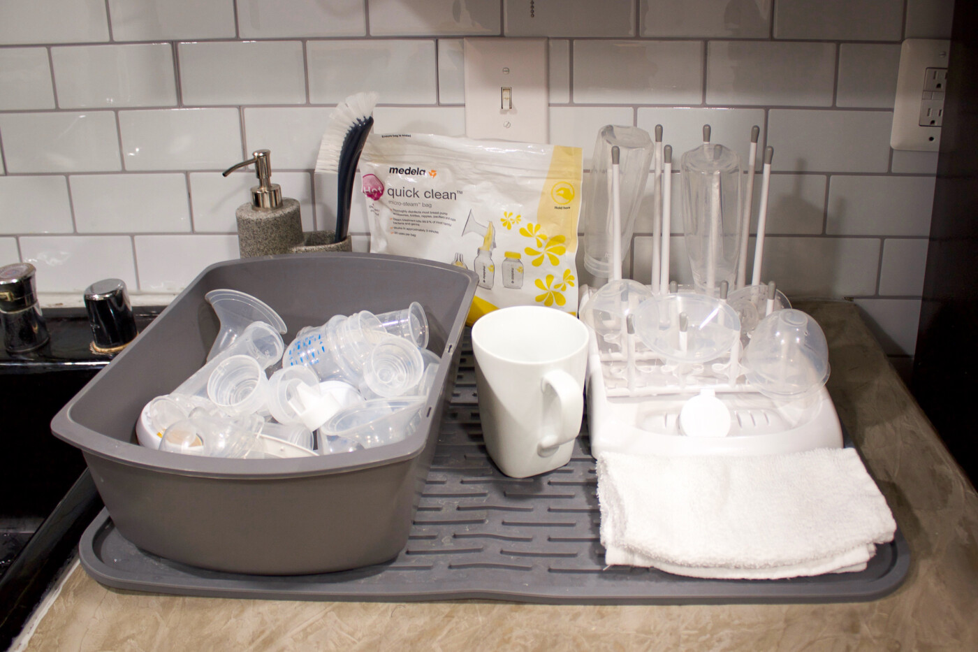
^^ I contemplated clearing out the baby items before taking photos of the space for a more ‘cleaner look’ but this is what our kitchen currently looks like and it is what it is. As much as I was hoping to create more countertop space… The space I did open up is slowly but surely being taken over baby bottle and pumping parts.
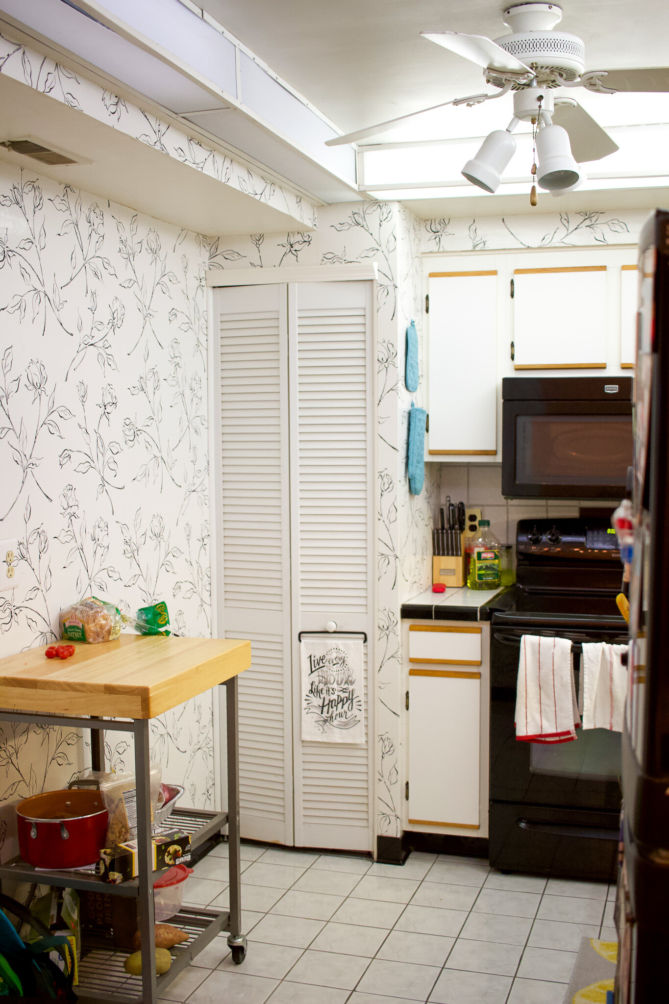
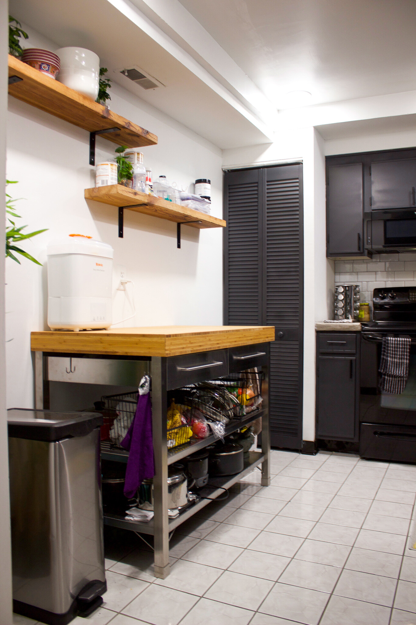
^^ As you can see from the photos above, we pulled down the wallpaper, sanded down the walls and gave them a fresh coat of white paint.
For the left side of the kitchen, we donated our small block butcher table to a local thrift store and replaced it with this much larger bamboo block table from Ikea. This is where I do alllll my food prep now and it’s soooo nice to have a decent amount of space to work on.
We also installed two reclaimed barn wood shelves on the wall to create additional storage space to hold dishes annnnnnd, yep, more baby items.
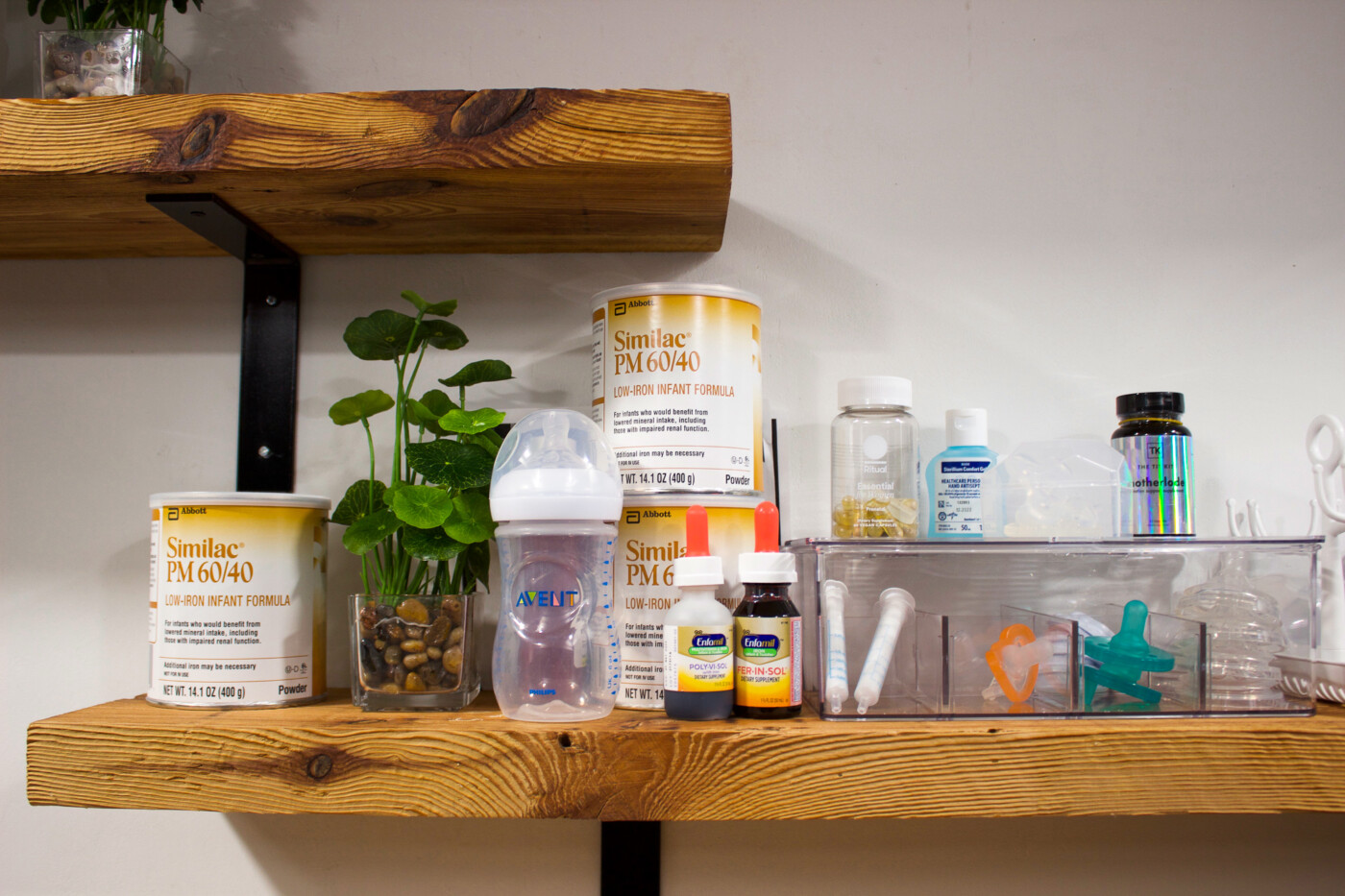
^^ The shelf we now refer to as “Beau’s shelf”.
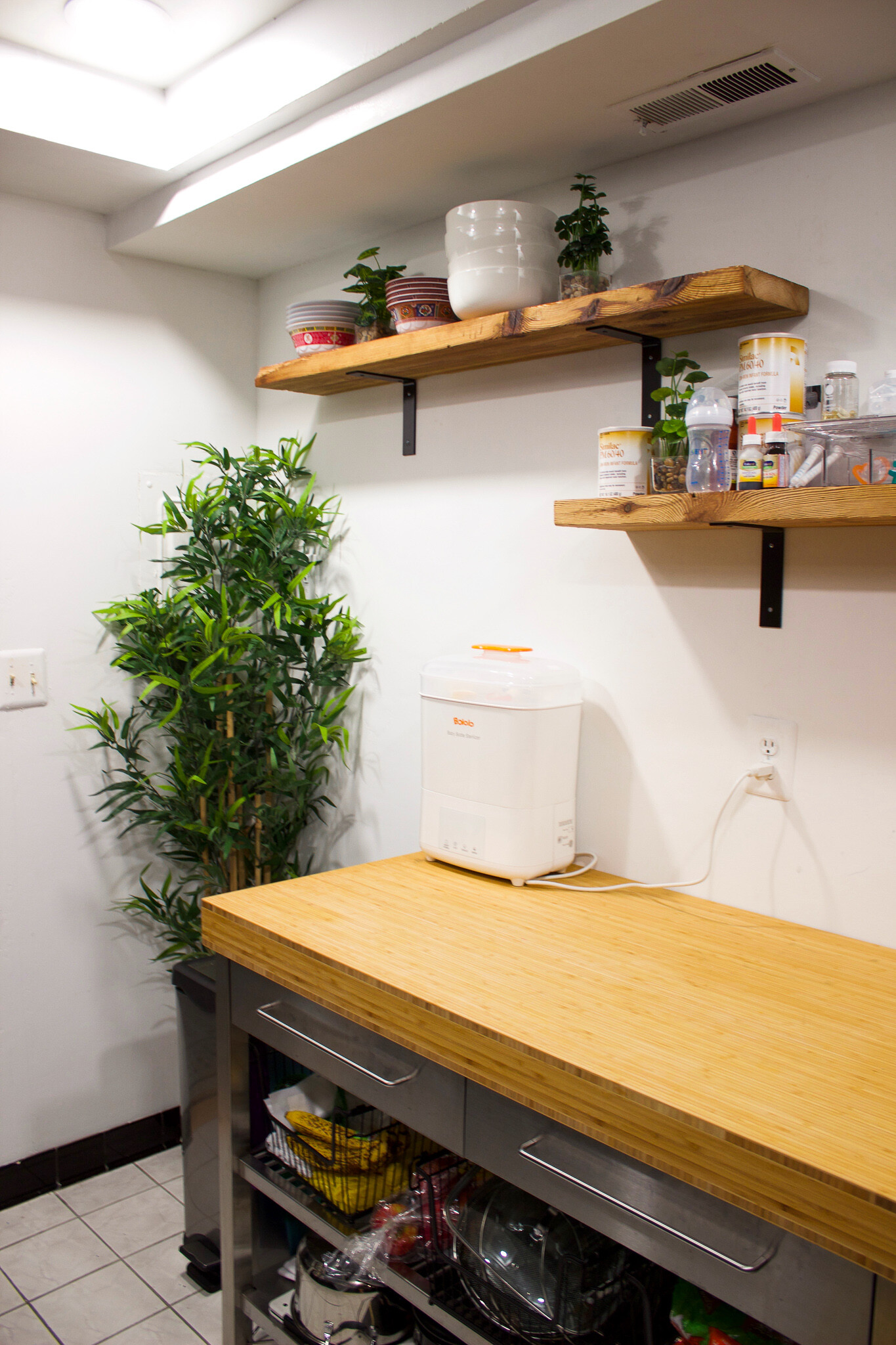
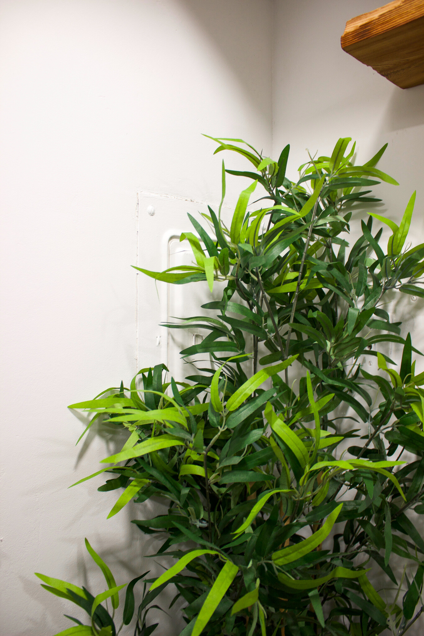
^^ The fake bamboo tree that was in our living room has been moved to the corner of the kitchen to hide the electrical panel and add a pop of color to the black, gray and white colorway.
As for the open wall space below the top shelf, I’d like to add a piece of art or photos that is food related but *not* cliche, if that makes any sense. TBD.
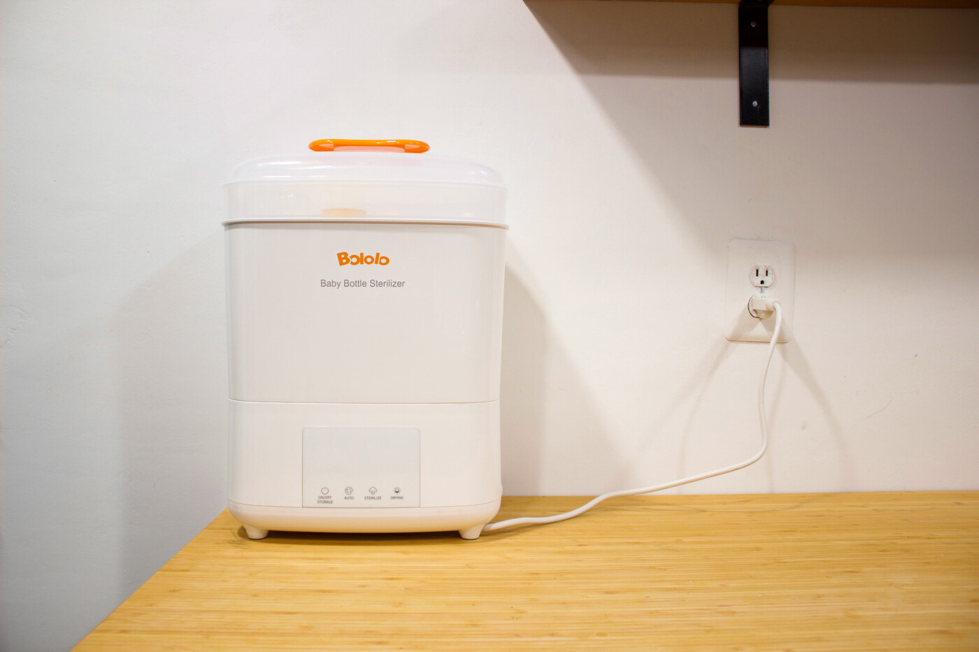
^^ A timesaving baby bottle sterilizer that holds up to 11 bottles and parts at a time. It sterilizes *and* dries the bottles in 60min. Charles and I love this thing.
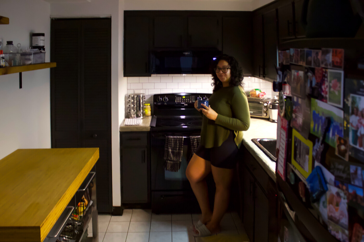
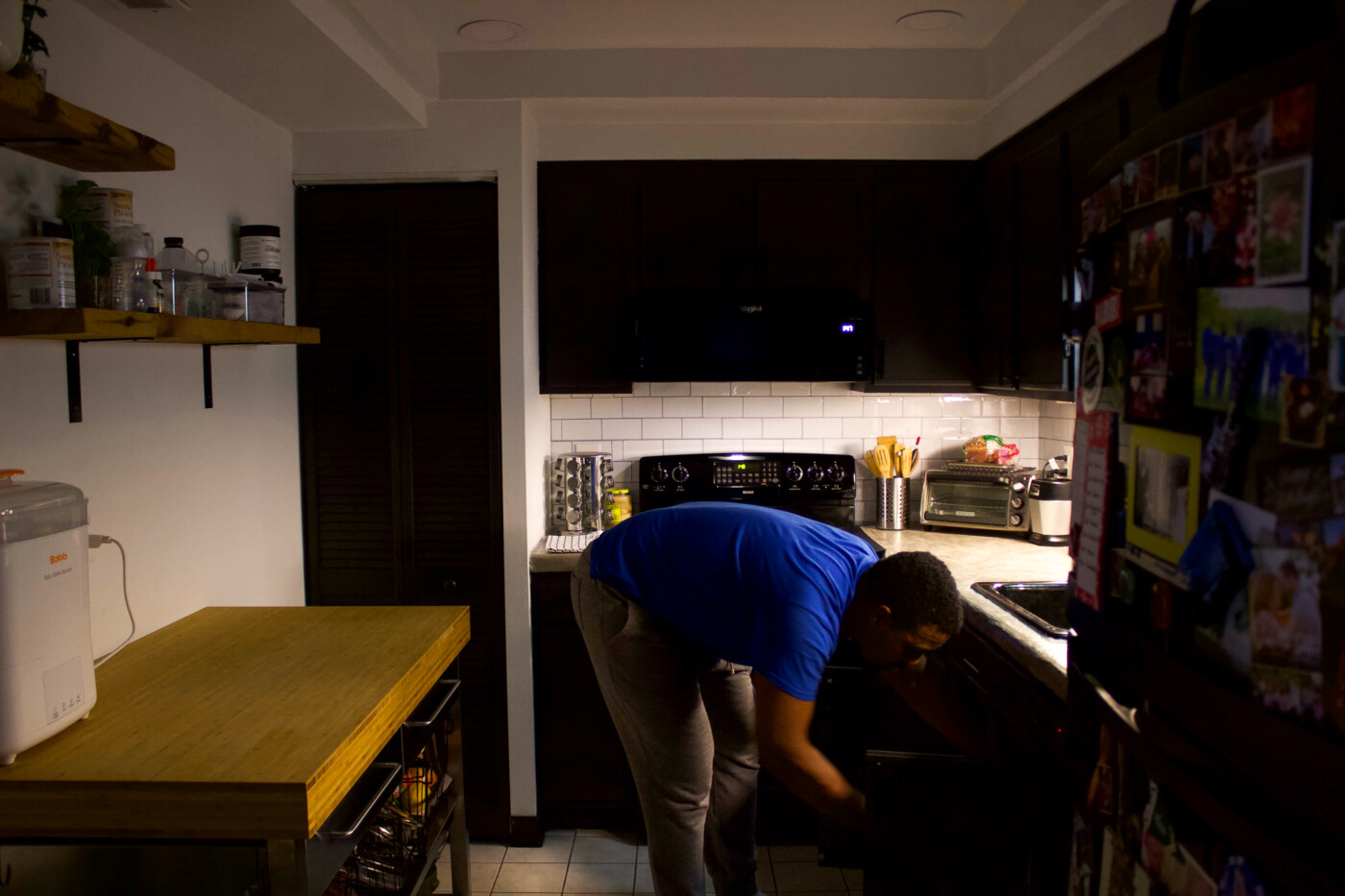
^^ Lately, we’ve been only using the underlights in the kitchen since the bright, daylight bulbs we have in the ceiling make Beau jump/squint and cry whenever we carry him with us to grab a bottle. New parent vampire life at is finest.
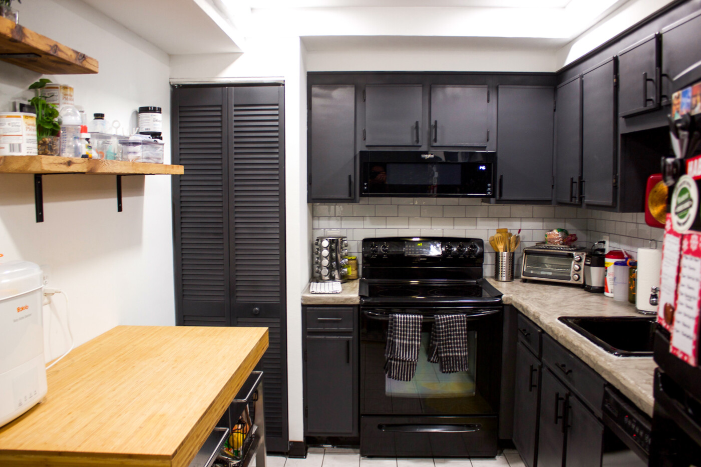
And that’s that. Our old kitchen painted brand new with our own bare hands… er, Charles’s bare hands.
The last and final part of the condo we’d like to update is our bathrooms (the salmon pink tiles have got to go) but that won’t happen for another couple of years. We are diy-ed out and done with home projects for a long while.
The focus now is figuring out how to keep all these new baby items we’ve acquired from completely taking over our newly aesthetic home… Ha! Not sure if it’s a battle worth fighting but we’re gonna try.
Until next post.
xo, Setarra
7