The minute we found out BB’s due date, Charles and I knew we had to complete our lingering two home projects before BB’s arrival = dining room makeover and DIY kitchen renovation. If these projects weren’t done before BB popped out, we probably wouldn’t have time to work on these spaces for another year or two.
Sooooo beginning in March, we set about working on our dining room makeover which was completed in May. Then, we transitioned to working on our kitchen renovation in June; we have one last project to complete and then we’re done done done!
And so now it’s time to reveal what the dining room looks like all put together…
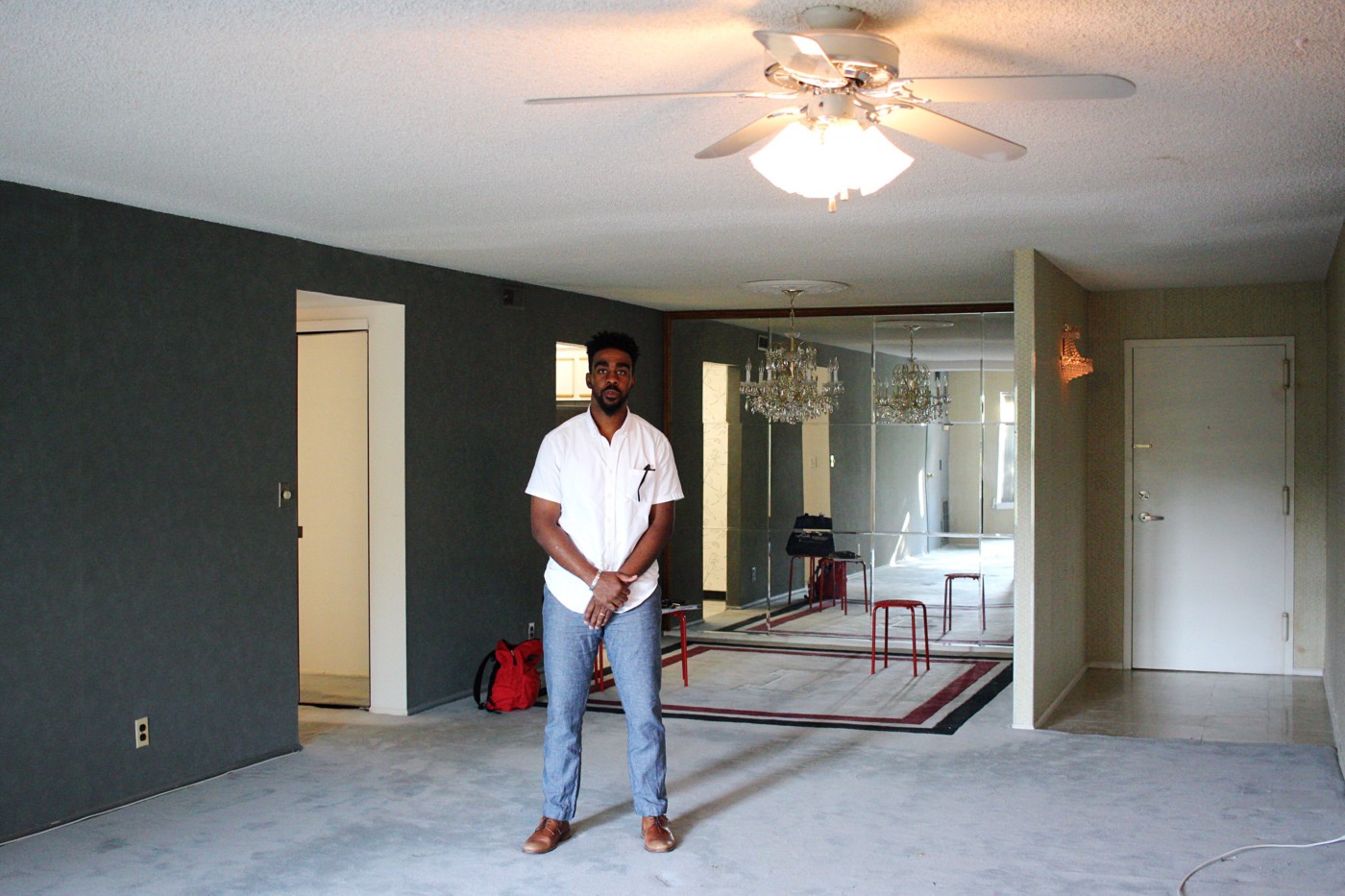
^^^ But first a quick look at what the dining room space looked like when we first bought our fixer upper of a condo before we moved in. Pretty dated, right?
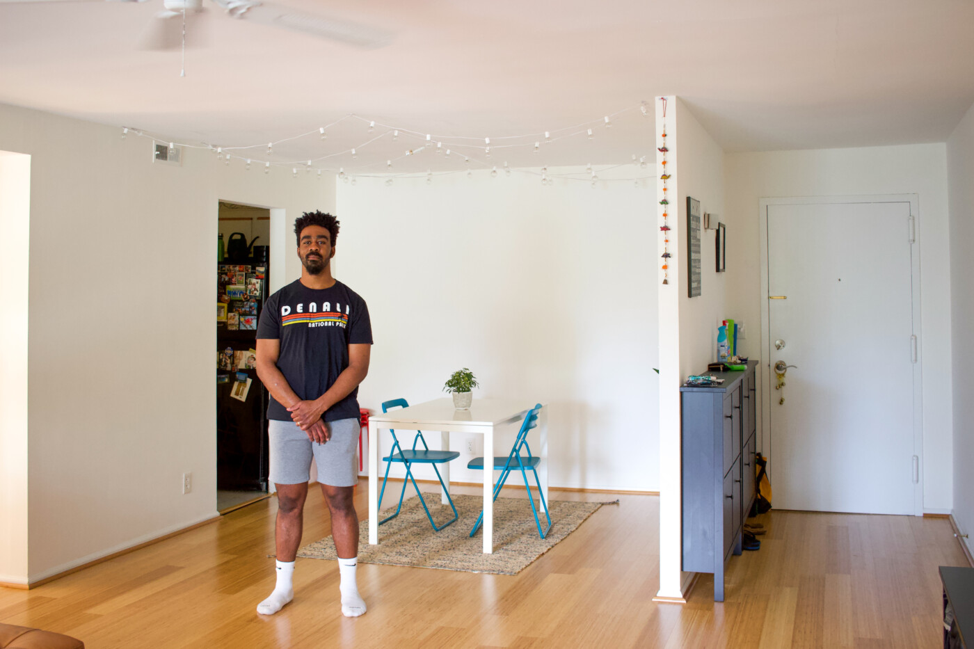
^^^ And what the space looked like after our first round of renovations (taking down the wallpaper, painting the walls white and replacing the carpet with bamboo flooring) when we initially moved in. This is pretty much how our dining room looked like for the past two years of homeownership.
And nowwwwww.
Drumroll for the grand reveal of our dining room space that we’ve enjoyed living in for the past couple of months!
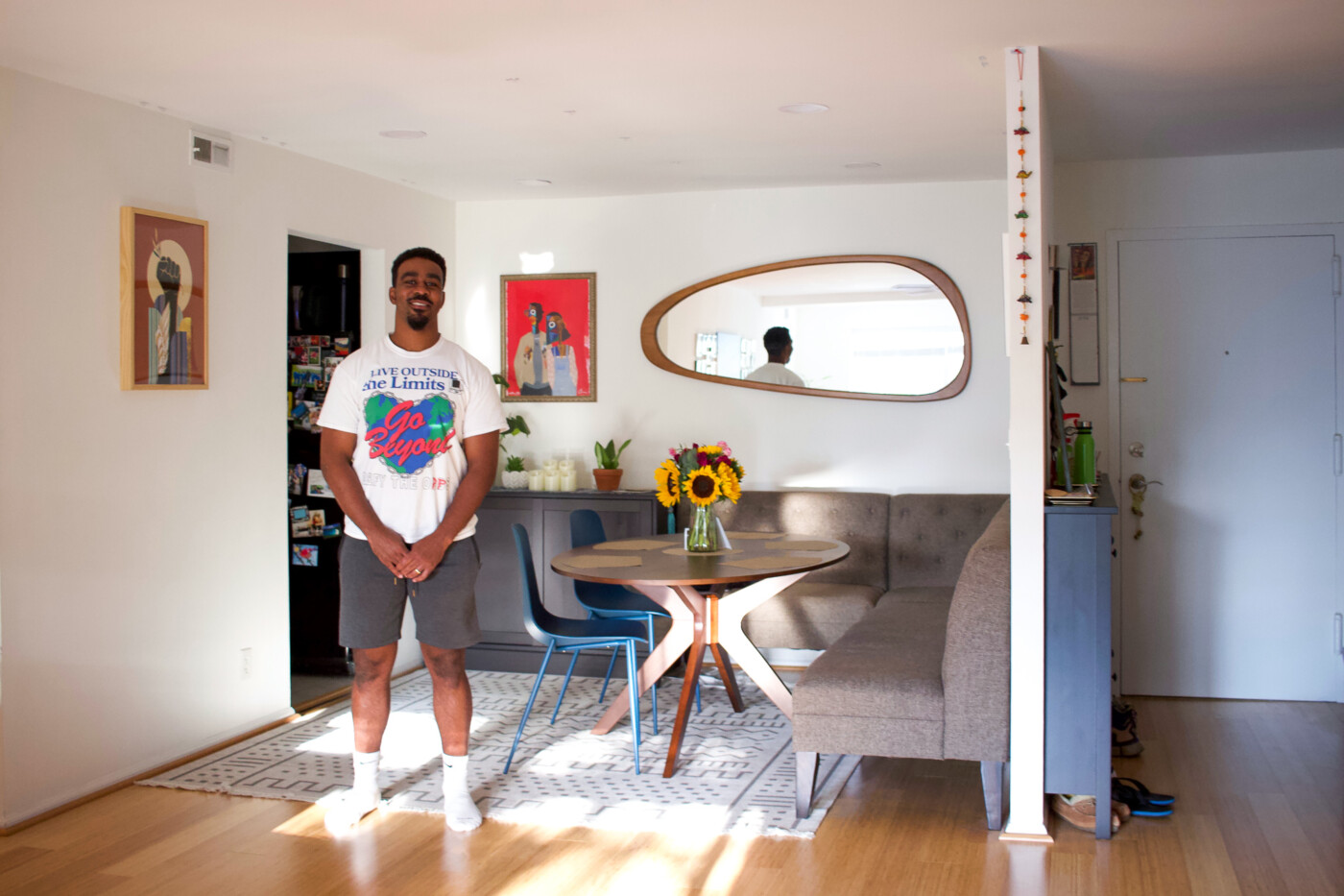
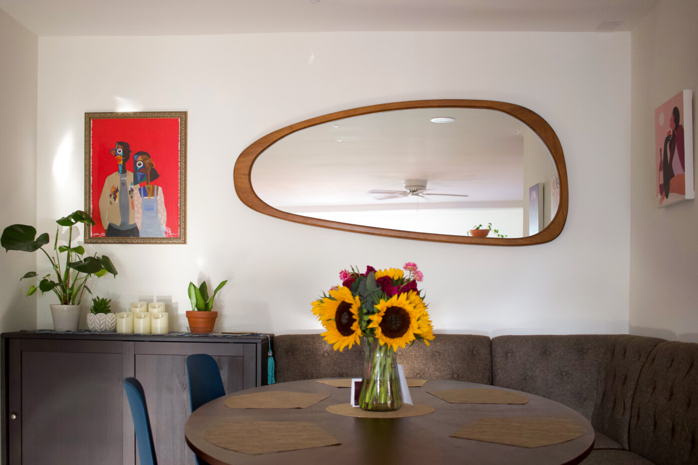
^^^ TaaDaaaaa… A space inspired by the decor of one of Charles and my favorite Thai restaurants in the Northern VA area a.k.a Sisters Thai – Living Room Cafe. I actually wrote a post about the restaurant a long while ago and the food love is still going strong – I highly recommend anything on their menu with duck on it.
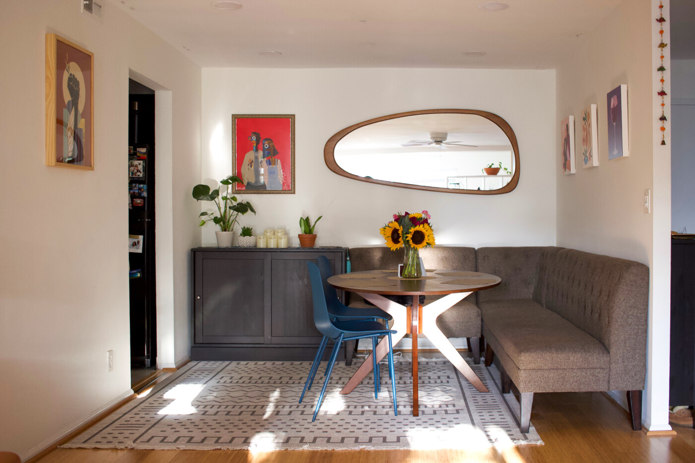
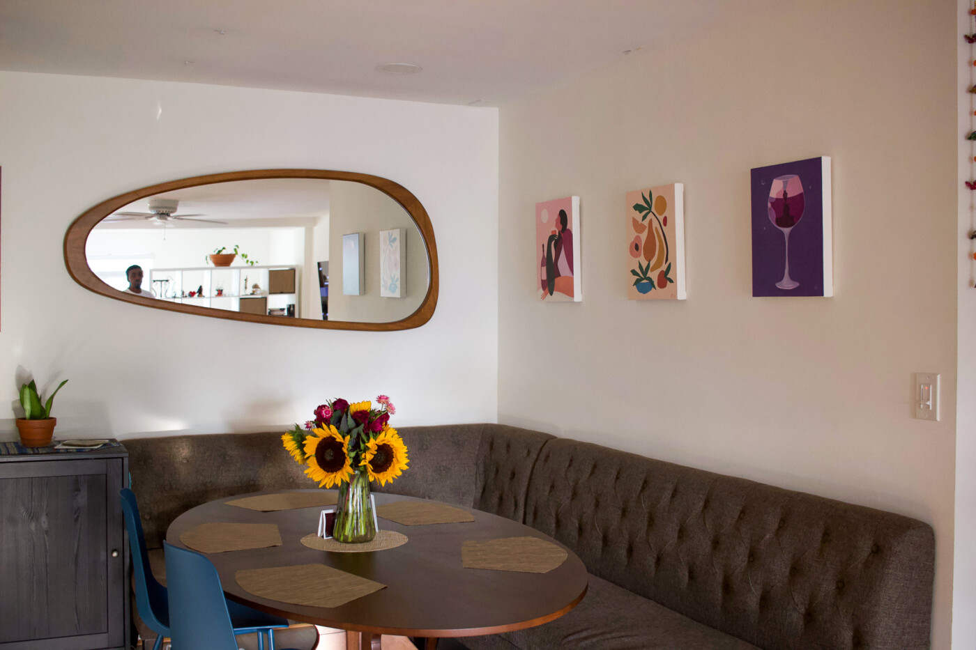
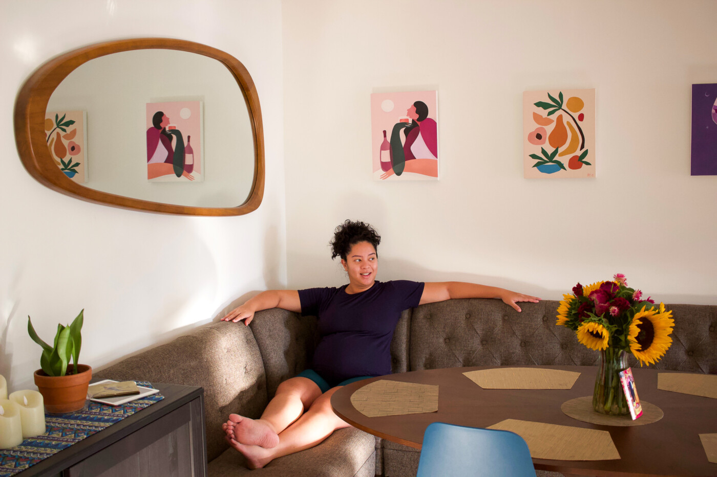
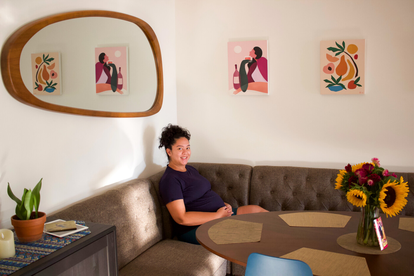
But back to the overall aesthetic, Charles and I wanted to create a cozy, artsy and functional dining area that made the most of the square space. We initially considered going with a round table but then we happened upon this dining nook seating via Ashley Furniture online and were hooked on creating a ‘nook vibe’.
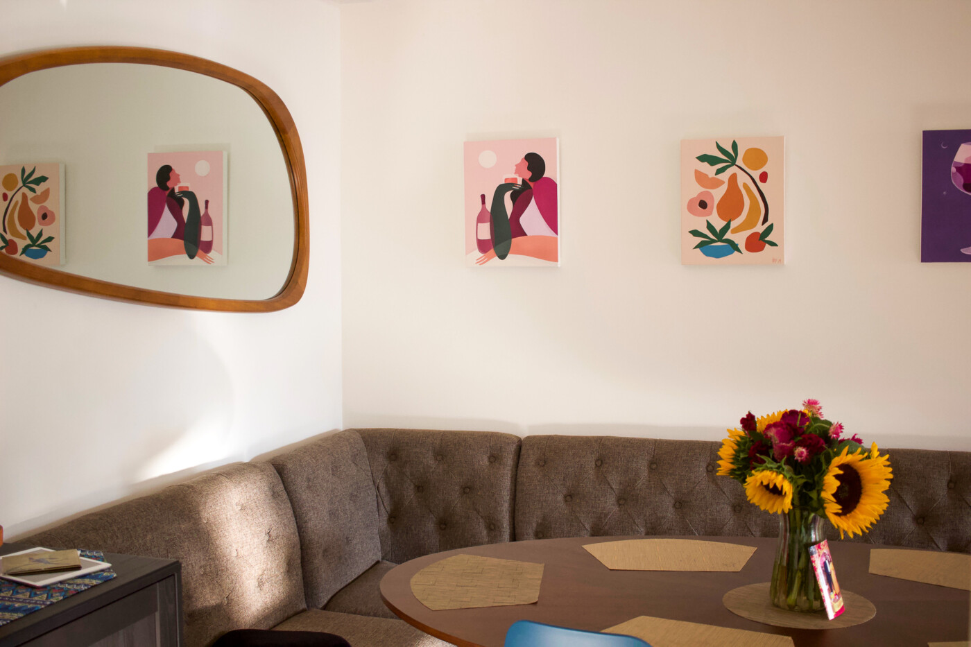
Add in this oval dining room table and pop of teal chairs via Article and a chest cabinet via Ikea… Which we measured everything 3 times over because it was tight squeeze trying to fit everything perfectly into the asymmetrical, L-shape layout… Everything really came together in a way that makes the nook feel like a custom fit.
** I shared in this post links to the art and mirror we acquired throughout this past spring season to decorate the walls of the room.
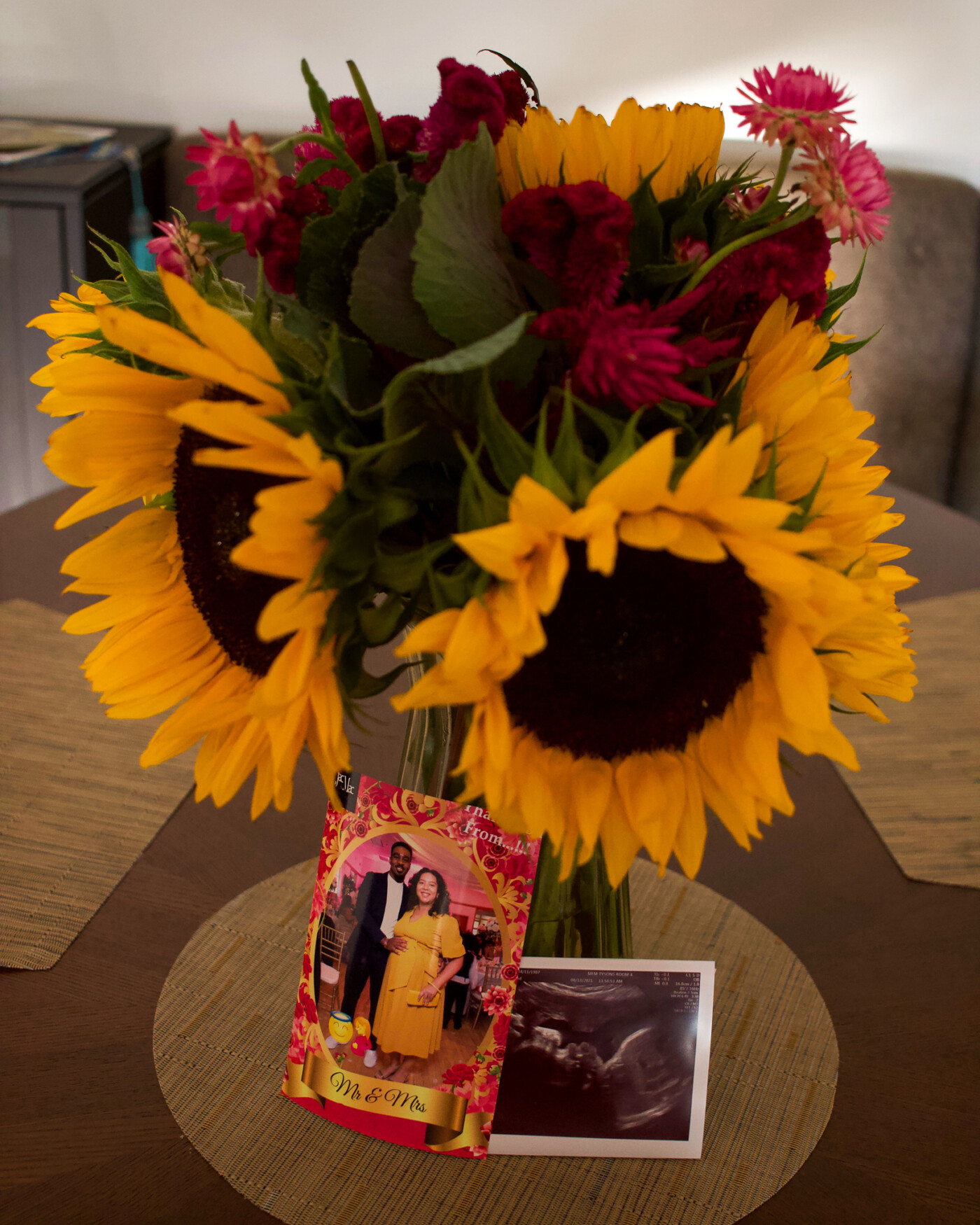
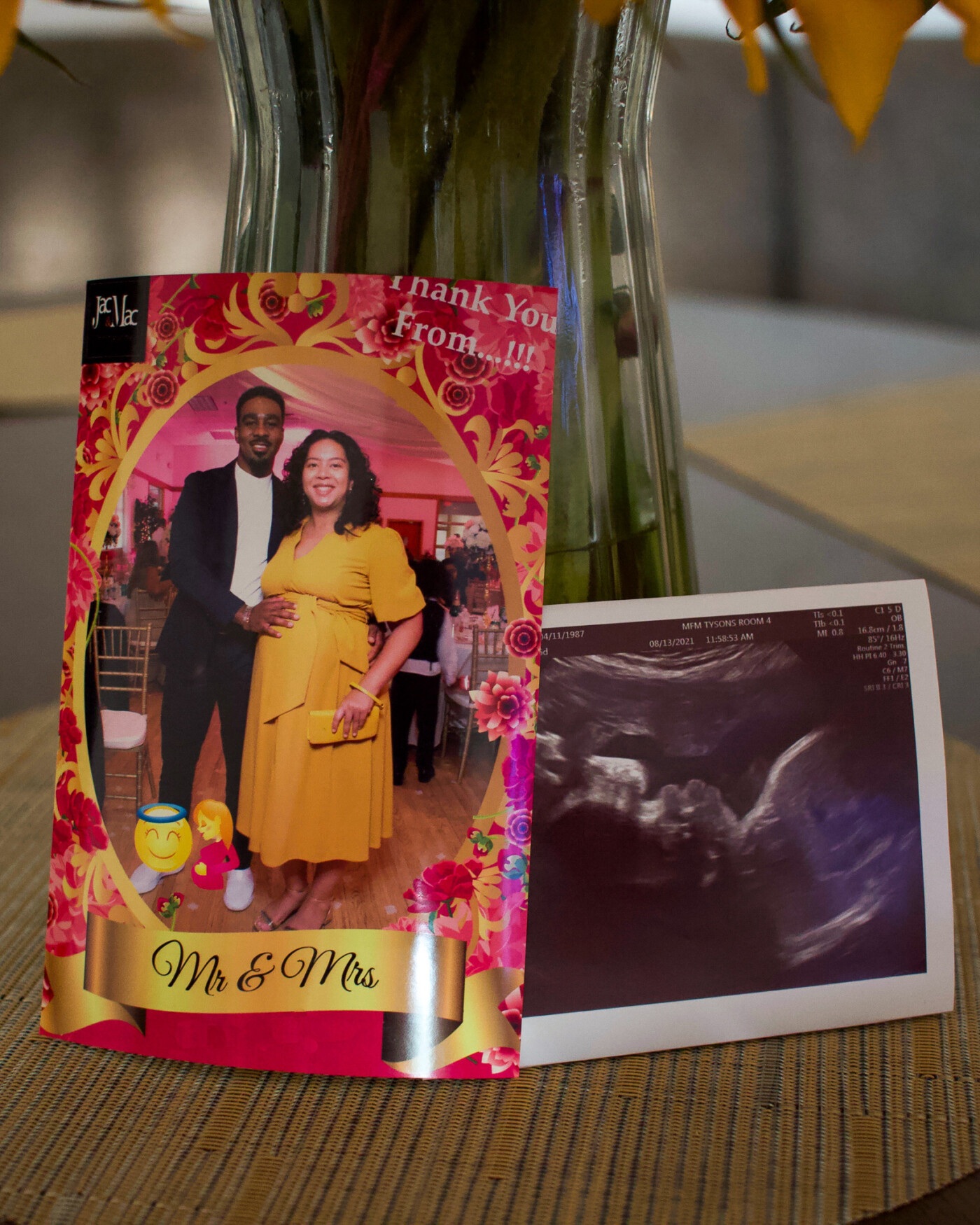
^^ Photobooth pic of us from my brother and sis-in-law’s wedding and a 31 week ultrasound of our lil BB. <3
Charles and I have been co-habitating for 8 of our 14 years of togetherness and we are both in agreement that this is by far the *most* non-basic, ‘adult’ dining room we’ve ever lived in lol. When all these variants get under control, I’m really looking forward to hosting a get-together with family and friends in the space. One day, probably next year.
In the meantime, if I had to be completely honest… Despite declaring the space as “complete”, I still think the walls could use some more art but our dining room budget is officially closed and all future investments have been directed towards all things BB preparation.
Until next post.
xo, Setarra
8